Inky Review: Side-by-side comparison among Sailor Studio 123, 224, 343, and Manyo Fuji
写乐紫灰色层析彩墨对比:工坊系列123, 224,343,万叶系列紫藤花
(Click to enlarge 点击查看大图)
The ultimate grey-purple shading ink comparison is finally out! I know there are lots of green/blue/purple/pink shading inks on the market. It is really hard to pick out a specific color based on a single ink swatch. Especially for Sailor, they have released so many purple shading inks, which includes the newly released Manyo Fuji. Therefore, I made a side-by-side comparison between Fuji and some other similar colours to show the colour differences. At a glance, all 4 colours look so similar that they could be from the same ink. When you look closer, the nuance of these colours lies in the purple tone.
终极紫灰色层析彩墨对比来啦!市面上有很多绿色、蓝色、紫色、粉红色的层析彩墨。单一的试色是非常难以区别他们。尤其是写乐,出了无敌多的鬼打墙颜色。所以这次我出了直接的紫灰色彩墨对比。主要对比写乐万叶系列最新出的FUJI紫藤花色和其他三个非常相近的写乐彩墨。乍看上去,四个颜色看着鬼打墙一样。仔细看才能发现四个紫灰色的紫调各有不同。

Sailor studio 224
写乐工坊224
224 is more blue among the 4 colours and it is relatively saturated as a purple/blue grey colour. In regular writing, shading effect is strong to show through in a Fine or Medium nib.
写乐工坊224相对来说在4个颜色里是更偏蓝的。层析能力也很强。F尖或者M尖书写可以看到明显的蓝紫层析。

Sailor Manyo series - Fuji
写乐万叶系列-紫藤花
Fuji is very similar to 224 except it is leaning more towards a saturated purple rather than blue. It also has the same level of shading ability as 224.
万叶系列的紫藤花和224非常接近。紫藤花更偏向饱和度高一点的紫色而不是蓝色。层析能力和224一样强。

Sailor studio 123
写乐工坊123
123 is another colour that is also extremely similar to Fuji, where its purple tone is leaning more towards purple-red. It’s slightly not as saturated as either 224 or Fuji. However, its shading property is just as strong. It is difficult to spot the purple-red tone in the blob. It is easier to spot the purple-red tone in regular writing such as a F nib or a M nib.
另外一个和万叶紫藤花特别像的颜色就是工坊系列的123。不同的是123 的紫调更偏紫红,并且饱和度也不如紫藤花和224。但是层析能力依旧和224,紫藤花一样强。123的紫红调可能在大滴的试色中不明显,但是在正常书写的情况下,例如F尖或者M尖中,紫红调相对其他三个颜色来说还是挺明显的。
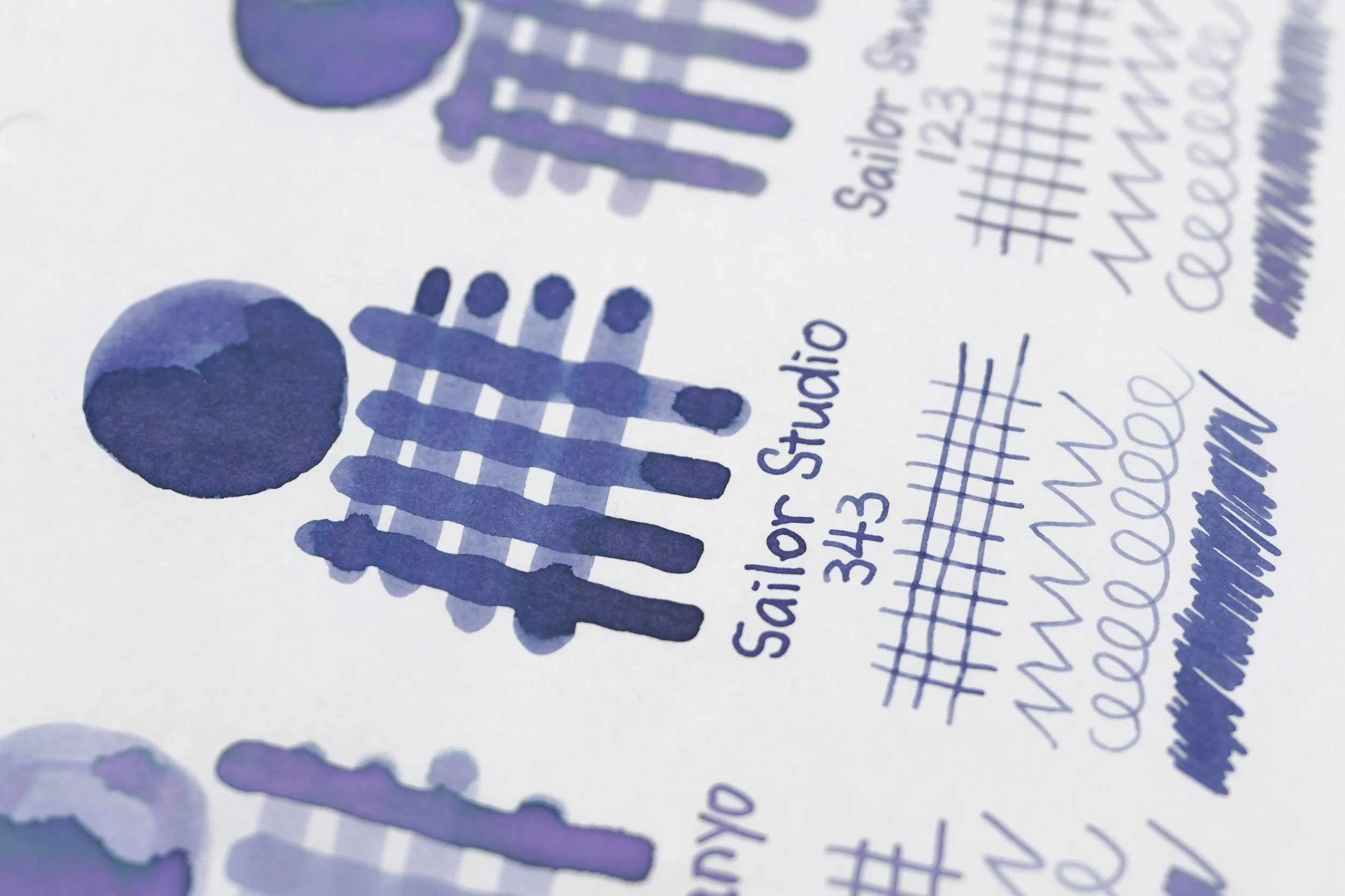
Sailor studio 343
写乐工坊343
343 is probably the easiest to distinguish among the 4 colours as it’s much darker and less saturated. Its shading property is also the weakest among the 4. You can only see its shading effect in the blob, but not really in the writing. Overall, it seems to me as a dark purple grey colour.
写乐343大概是4个颜色里最好辨认的。在四者中,343是最深也是饱和度最低的,并且层析能力也是最弱的。在大滴的试色中能勉强看得出一些层析,但是在正常书写中,基本看着就是个深一点的紫灰色,看不出什么层析。
My thoughts:
我的个人想法:
Though the 4 inks look so similar to each other, they are all different colours. Personally I prefer inks with strong shading ability, like any of 123, 224 or Fuji. But they may be a bit pale in small nib sizes for some people. Then 343 would be a better option as it is darker.
虽然这四个彩墨看着那么像,实际颜色对比还是有差距的。个人来说,我更喜欢层析能力强的彩墨,例如123, 224或者万叶系列的FUJI紫藤花。但是这些彩墨小笔尖写起来可能笔尖比较洗笔水,那343的话会更适合日常书写。